note: the majority of images are edited stock photos
Analysis and Reflection
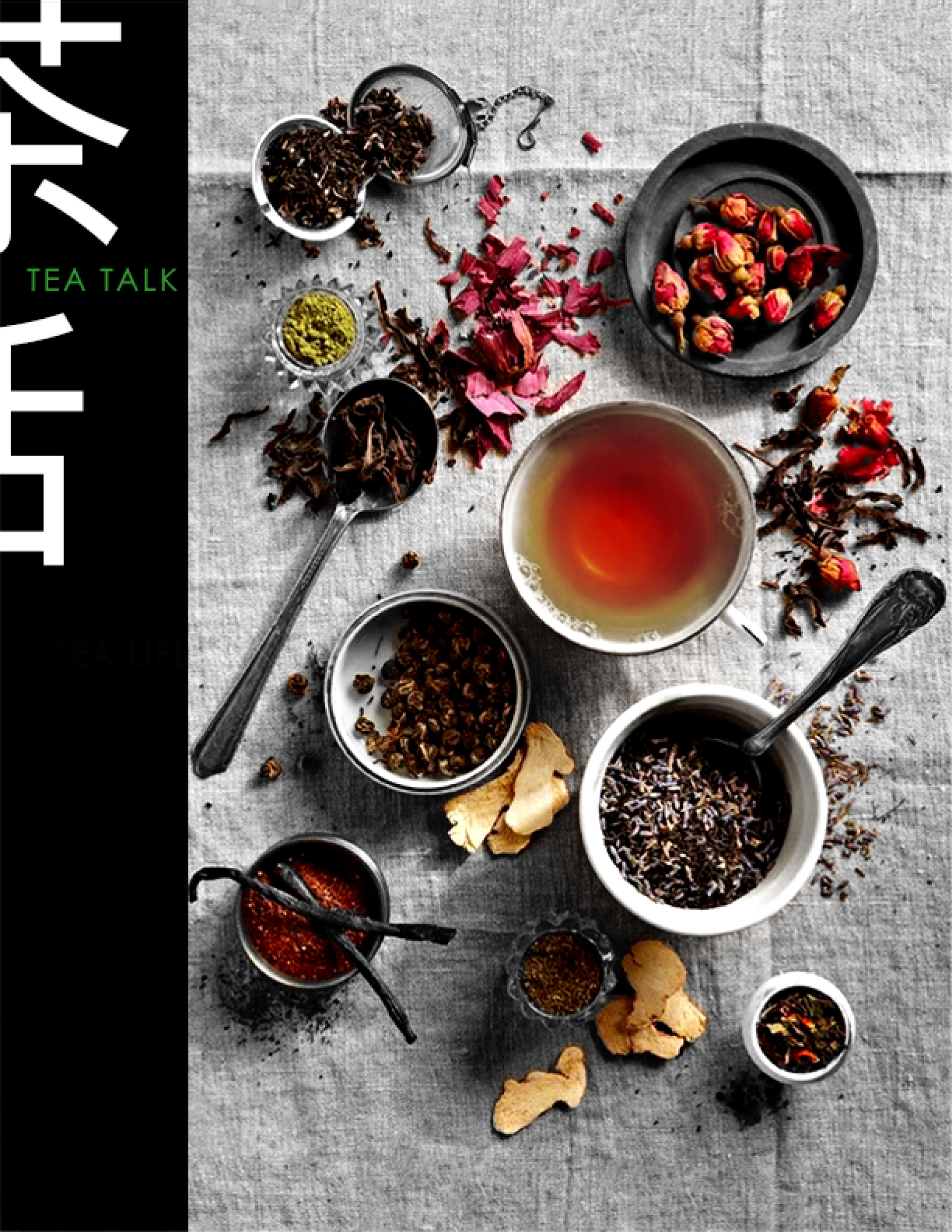
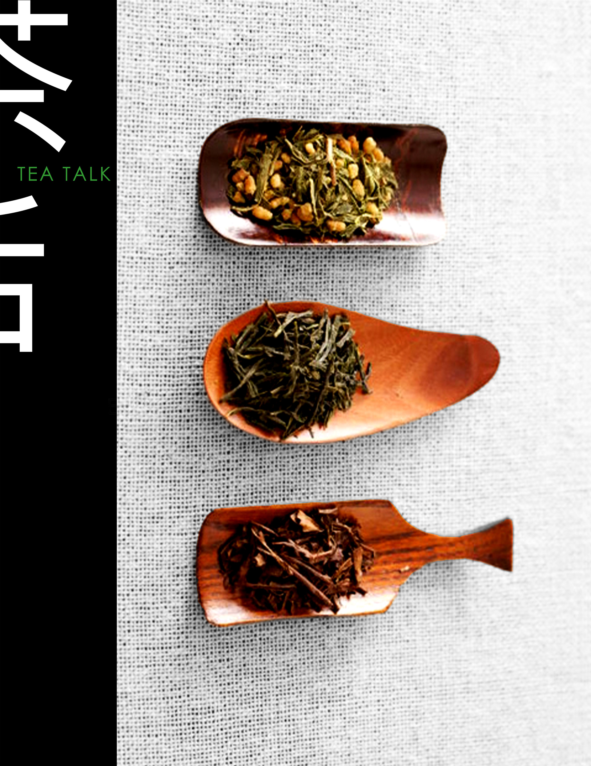
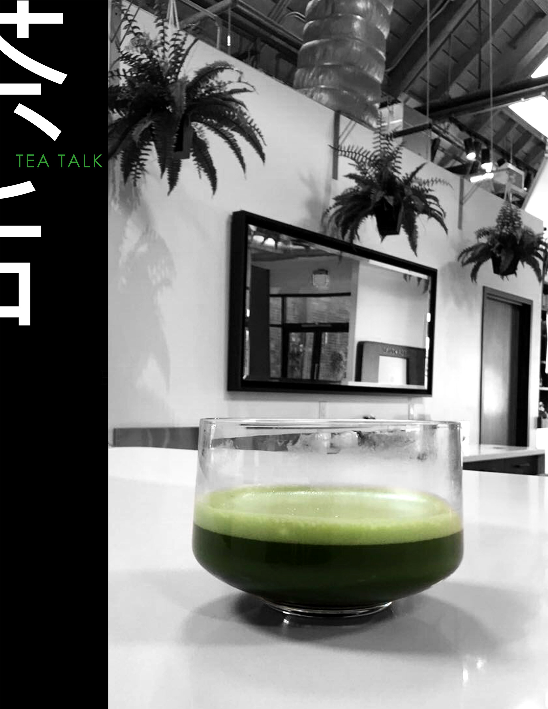
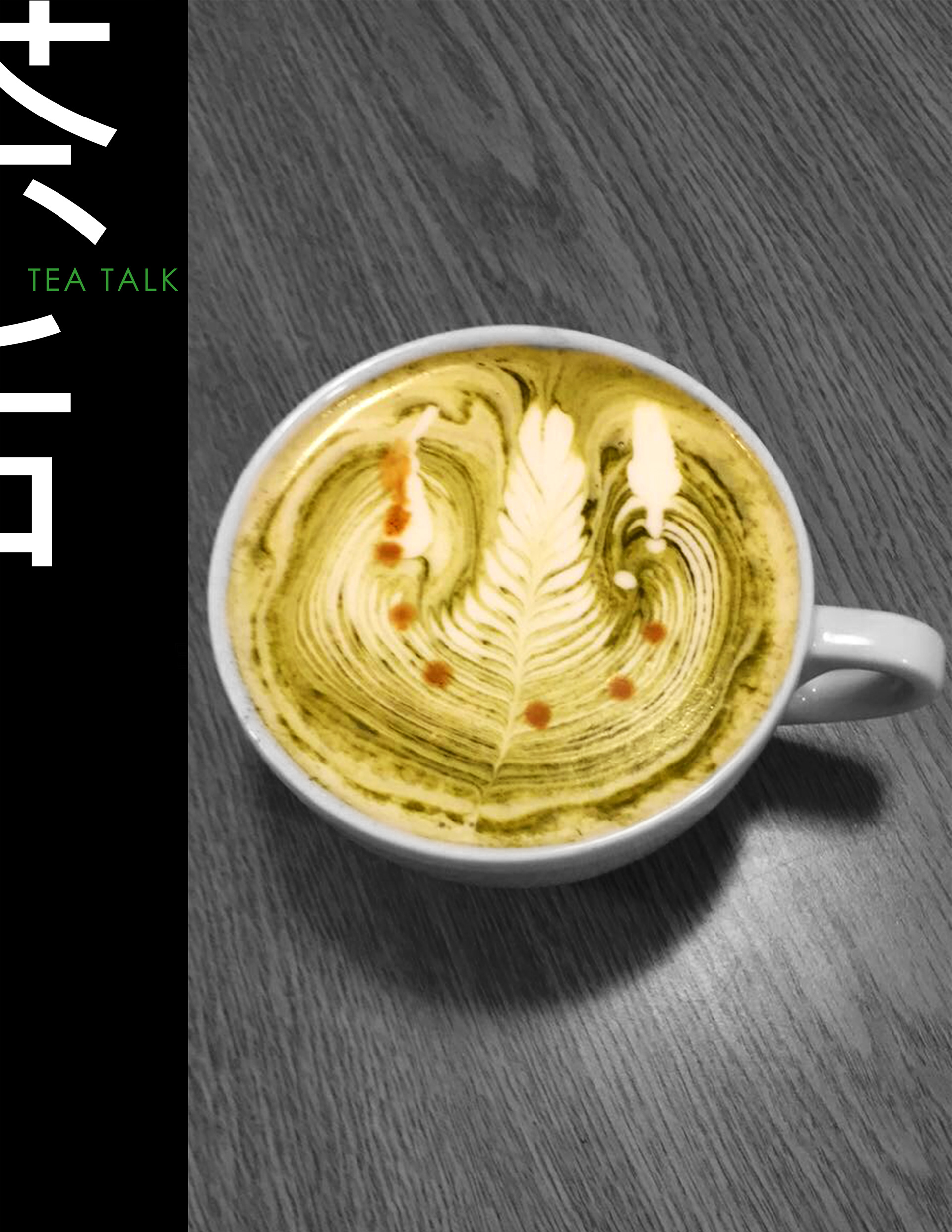
In creating this magazine, I was able to integrate a variety of my personal interests - tea, Chinese language and culture, and graphic design. I envisioned a multinational publication, and attempted to create a layout which could accommodate both English and Chinese content. The result is an elegant and clean aesthetic, reflective of the purity and simplicity of the Chinese tea ceremony, as well as the calm, soothing effects of tea. The front and back cover utilize both the English and Chinese names for the publication, regardless where it is sold, or which language it is published in. The split Chinese Characters showcase their beauty in a new aspect, as the strokes become integrated into an abstract design which frames the English title. Each cover also features selective color in some capacity, often to bring attention to the tea, as well as separate the cover from the sea of color often seen in many magazine covers, while providing a consistent aesthetic to enable quick recognition of the Tea Talk magazine brand.
Alternate Covers
A package design and advertisement I was assigned in tandem with the magazine
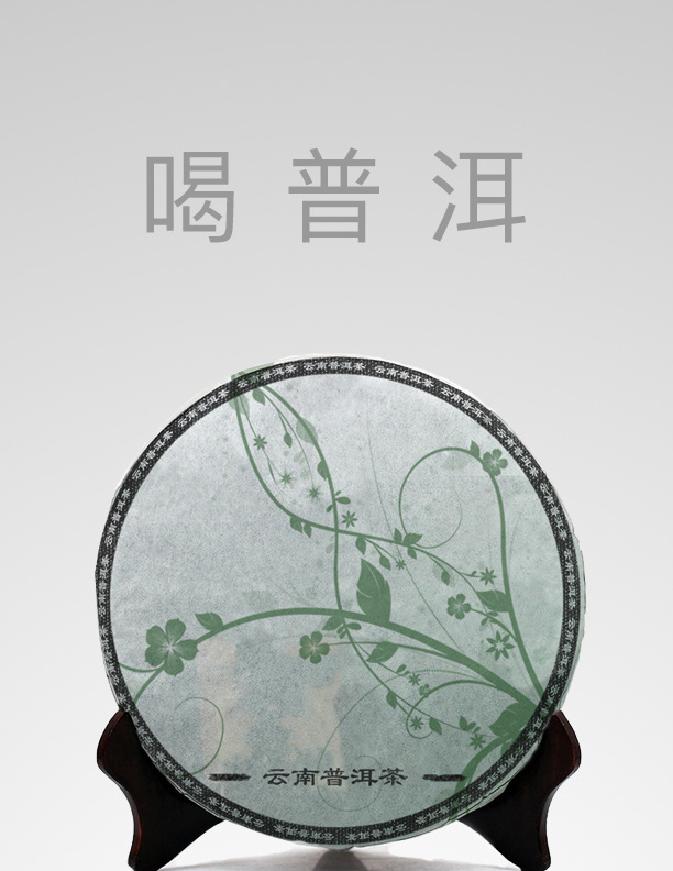
Large text reads "Drink Pu'erh"
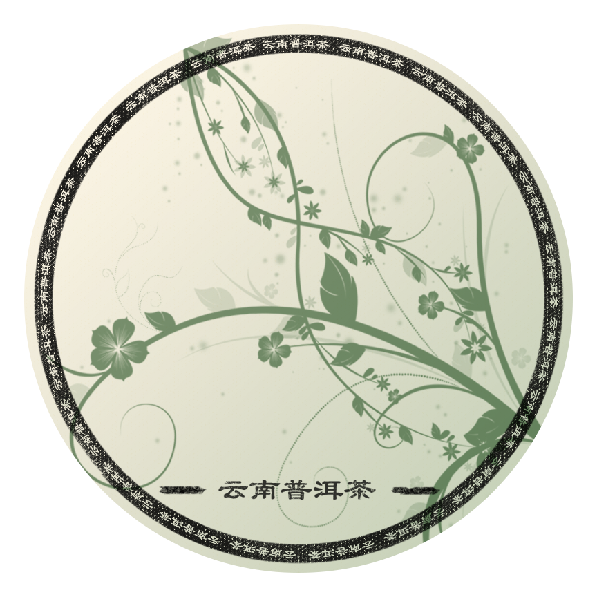
Package text reads "Yunan Pu'erh Tea"
Pu'erh tea is a fermented tea that is often packaged in round disks wrapped in a preservative paper. The package design tends to be organic in nature - often depicting pastoral scenes of the tea farm, or drawn landscapes. Inspired by this trend in design, I attempted to reflect the time-tested tradition, while also bringing it into a more modern feel, using vector shapes rather than traditional brush strokes.