
A set of logos designed for the small groups coordinated under Discipleship Ministries of Wheaton College.


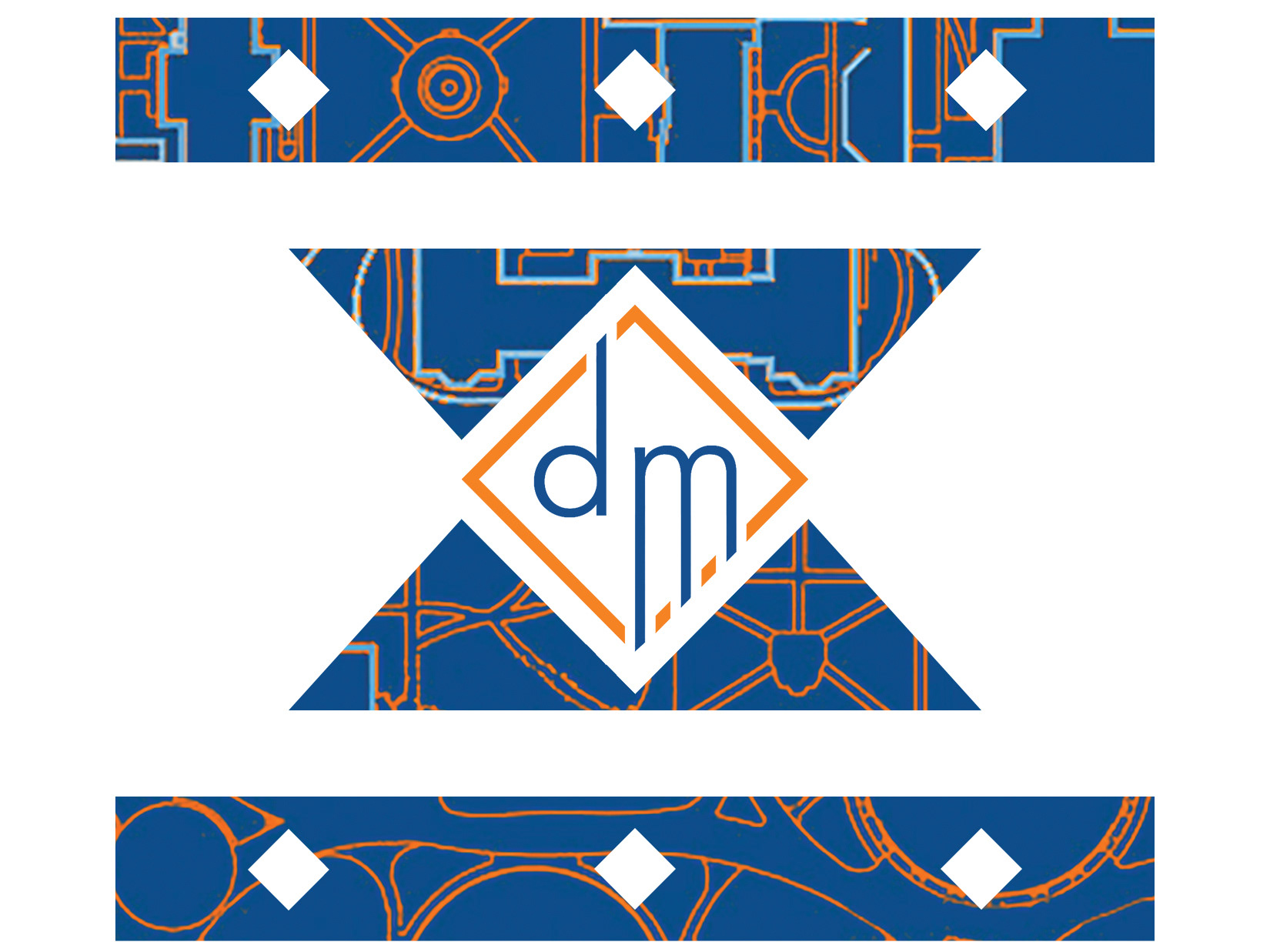
The Discipleship Ministries logo (center) with its iterations
A primary goal set for the Discipleship Ministries logo, as well as those for the various small groups managed by Discipleship Ministries, was to have a versatile design that could be used for various materials and layouts, while also remaining recognizable and cohesive within the logo set.

The Discipleship Small Groups logo, the flagship small group of Discipleship Ministries.
The original DSG logo was designed by a former student, with the form and feeling requested to be the basis for all the other logos. Thus, the only thing changed about the logo since the re-branding has been the colors and the addition of the borderless iteration. DSG is a primarily bible-study focused small group, thus the square design of the logo and professionalism expressed by the blue coloring aid in conveying the goal of the small group to take seriously the task of studying the Bible in a weekly community. Meanwhile, the orange conveys a sense of energy and liveliness often found within each small group community

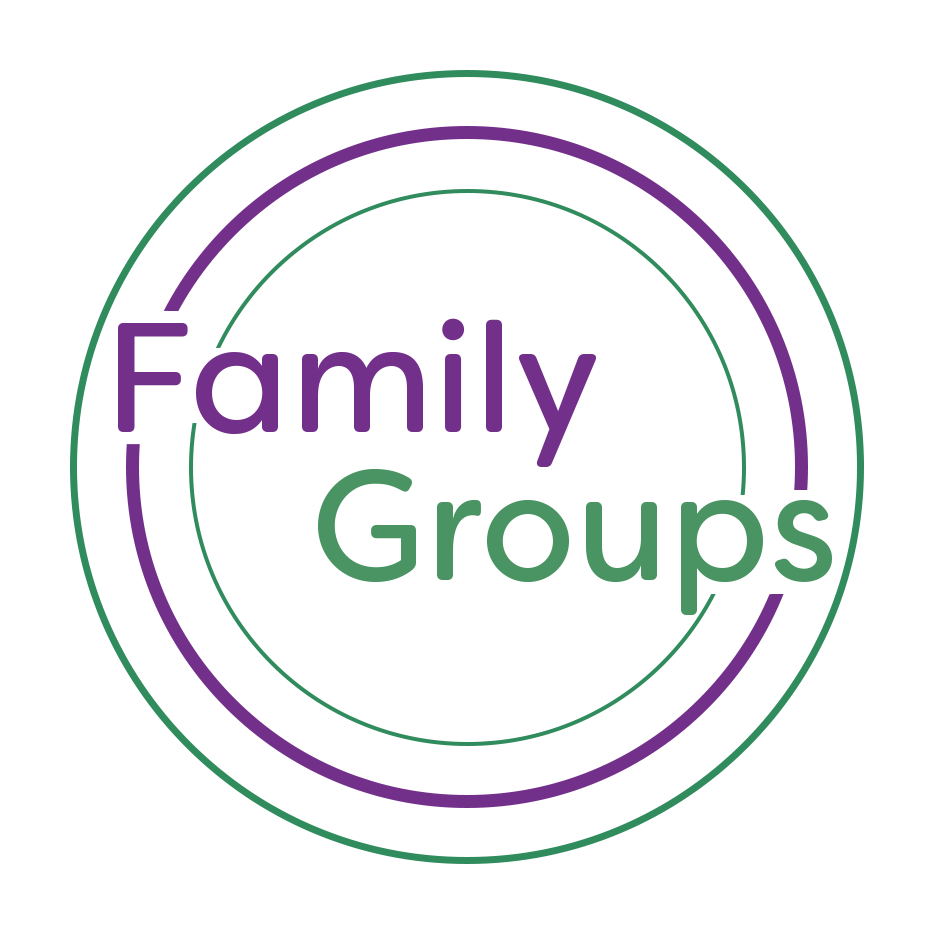
The Family Groups logo - a primarily Asian and Asian-American small group managed by Discipleship Ministries.
Family Groups focus on community and fellowship, especially centered around the sharing of meals. Thus, the circles serve multiple purposes within the logo design - they convey a sense of family and community within a tight group, as well as the dishes used when sharing meals together, and even the circular tables often gathered around in the school's cafeteria. The colors were chosen to convey a sense of growth and nurturing, from the green, as well as creativity and wisdom, imparted by the purple - all of which being facets found within a Family Group dynamic.

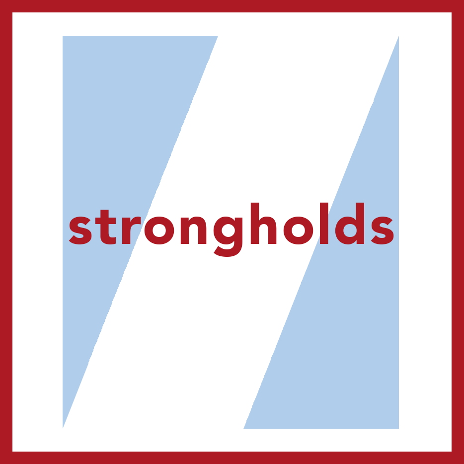
The Strongholds logo - Discipleship Ministries' small group focusing on sexuality and freedom from sexual sin
Strongholds is a small group of Discipleship Ministries that specifically deals with sexuality, issues of sexual sin and assault, and cultivating vulnerable communities in which members feel safe to be honest about topics that are often left in the dark, especially within conservative circles. The form of the logo holds various symbolic elements pertinent to Strongholds. Through the use of negative space, a beam of light may be seen breaking through haze, symbolic of the light a strongholds group brings to these important issues. The angle of the white space also conveys a sense of upward motion, symbolizing progress. The colors were also carefully chosen - red conveys a sense of strength as well as sexuality and passion - things deemed originally good by God that strongholds wishes to redeem - while the blue and large white space serve to convey a sense of cleansing and purity.